Hello again! The next assignment I'll be working on is over different types of story boards that inspire me, so without anymore waste here we go!
Story Board 1 (top left):
https://www.pinterest.com/pin/568298046710058653/
This image shows the outdoor image of a building that's going to possibly be constructed. This specific story board inspires me because it lays out so many ideas onto one plane, and that in itself is difficult for me and it's a skill I hope to gain.
Story Board 2 (right):
https://www.pinterest.com/pin/492299803000281372/
This image shows the interior space of a building that may be getting built. This story board inspires me because it's very organized and makes the viewer already feeling like they're moving around in the space based on how specific elements are arranged on this plane.
Story Board 3 (bottom left):
https://www.pinterest.com/pin/295126581811529939/
This final image is actually a story board for some kind of movie scene. This story board inspires me because it describes the interior space with these interesting sketches and designs while observing the scene being displayed. This is very important in my particular interior design education because my preferred career path is going to be Set/Stage Design for movies and plays.
Monday, March 27, 2017
Palladio Response
Hello, everyone! This morning, I'll be making a post about an building that's inspired by the architect Andrea Palladio. The point of the assignment is to look within the past 25 years, however I couldn't find anything closer than within the past 31 years--so please, bare with me. The building I found is 2 Homs Court (built by San Francisco's House & House Architects). The visible inspiration is in the symmetry of the structure, the patterned placement of windows, and the application of columns on the sides of the front entrance. All of these aspects are very obvious when viewing Palladio's work, hence the inspiration.
Below is the image and the link to the website I found it from.
Sunday, March 26, 2017
Unit 8 Summary
Hello, everyone! This post is going to be final discussion of Unit 8 and what I learned. One main topic that I'll talk about is the use of furnishings and how they effect the experience of a space.
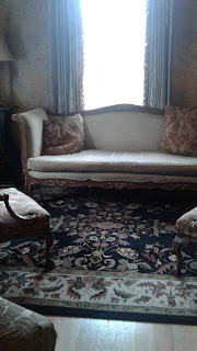
Furnishings are pretty important when creating interior spaces because they give viewers a certain feeling and experience. For example, in the Gratz Park Inn here in Lexington, there's this couch in the lobby. If I had to describe it, I'd say that it gives off a very traditional feeling when looking at the beige fabric and dark brown carved wood. The traditional appeal it gives off is very successful for the location since this inn is in Gratz Park, which is a historic district. Not only does it bring a sense of comfort and status to the room, but it also feels like it brings the whole room together; if it weren't there, the space wouldn't be as successful.
Below is an image of the couch in the Gratz Park Inn.
Thursday, March 23, 2017
Representation
Hello, again! The second blog post for today is going to include my answer to the following question: What is representation as it pertains to interior design and architecture?
After hearing about what some of the upperclassmen in the Interior Design program said during the lecture yesterday, I've kind of come to the conclusion that representation is the act of portraying combined ideas from the designer and the client to create an entire piece while also creating feelings within others who experience the space. Representation is utilized in interior design and architecture to display ideas and emotions of the time.
Magazines
Hey, guys! Today's post is going to be going back to the discussion of the Better Homes and Gardens magazines from the 1940s. However, this time I'll be posting five pictures that I found online that show what kind of styles were used during that period and writing about it.
In the images provided, it's obvious that during the 1940s the prominent style was traditional and functional. Along with this, a lot of wood finishes and bright paints were utilized (as seen in the image in the top right that I obtained from a student-based blog post from 2010, which I will leave the URL for at the end of this post). The Better Homes and Gardens magazines often feature people interacting with a space or of the spaces alone, and during the 1940s many of the covers were drawings. Many textiles were used for the tile floorings and wallpapers. Overall, homes shown in the Better Homes and Gardens magazines during the 1940s portrayed structural buildings that are highly functional.
Here's the link for the student blog that I brought up earlier: http://hgranetz.blogspot.com/2010/09/with-its-cooking-ideas-gardening-tips.html
Monday, March 20, 2017
Magazine Activity
Hello, everyone! This morning, I'll be posting a couple of scanned images of a worksheet I had to complete after finding a magazine issue from a certain time period. My discussion group was assigned Better Homes and Gardens magazine, and I specifically was assigned the 1940-1950 decade.
Below are the magazine cover and the scans of my worksheet:
Thursday, March 9, 2017
Favorite Furniture
Hello, again! So the second post for today is going to be a discussion over a chair in my day-to-day life that's my favorite. Personally, if I had to think about the chairs that I surround myself with on a daily-basis, I'd probably choose the blue chair that's always sitting in my living room. This chair is almost bowl-like and is surprisingly comfortable. To me, this chair allows for the human body to have really good structure while relaxing. When first moving in, it'd been my chair and I actually really liked it, but I never really used it. However, now that I'm moved out, I've started to sit in this chair more and more (I'm honestly sitting in it right now.).
Below is an image of myself sitting in this chair while working on some homework.
Campus Dining
Hey, guys! Today, I'll be making two posts; this one specifically is going to discuss two on-campus dining locations that I've been to and talk about some of the furniture in each. The chosen locations are The 90 and Rising Roll.
At The 90, I noticed there were several types of furniture throughout the space, but particularly in the front lobby. A lot of it was focused on comfort and experience; the seating areas are grouped, which makes me think of study groups. This casual setting can sometimes help to improve someone's ability to learn because there's other stuff going on around them so they're able to focus on they're work (I'm totally just going off the idea that everyone learns in their own kind of nerdy way).
At Rising Roll. there are a lot of basic chairs and tables that appear to be grouped just like in The 90. However, the difference is the scale of the space. While in The 90, you can notice generally that amount of people all the time along with a bunch of different locations for food, and then in Rising Roll there isn't as much space because the general scale is greater than in The 90.
Below are the images of The 90 and Rising Roll! (The ones around the above paragraphs are the ones where they're furnished in The 90, and the bottom two are of Rising Roll).
Tuesday, March 7, 2017
NYT Favorite Rooms
Hello, everyone! Today, I'll be telling you about a room that I saw on a list of popular rooms from the New York Times and why I chose it as my favorite. I'll be sure to include the link to the website as well as an image of the space.
The room I chose gave me major Sherlock Holmes vibes, and I think that's what was pushing my interest in it. However, there are very interesting design factors that play a part in the overall composition of this room. Something that really attracted me to this room is the color scheme, which includes mostly grey-toned earthy colors but then this pop of violet and yellow. There's also a nice combination between hard/soft lines (along with points and curves in those lines) and rough/smooth surfaces. These things all add to the application of contrast, color, and line.
Below is the image of the room I chose as my favorite and the link to the website I got it from:
http://www.nytimes.com/slideshow/2016/12/26/t-magazine/best-rooms-design-faye-toogood-max-lamb-luca-guadagnino/s/best-rooms-slide-R2RX.html
Monday, March 6, 2017
Comfort, Status, Craft
Hey, guys! Today I'll be making a super quick post about the key ideas comfort, status, and craft. We were asked to watch two lectures over different furnishes throughout different time periods and where/why/how they were utilized in varied spaces. Along with that, the point of the assignment was to sketch nine furniture pieces, which would give us three examples of each key idea.
Below, I've attached a scan of my sketches.
Sunday, March 5, 2017
Case Study: Furnishings
Hello, everyone! This post will be discussing a specific furniture piece that's located in my case study building, which is the High Museum of Art in Atlanta, Georgia. This furniture piece is a bench that's placed in one of the gallery rooms and serves both as a center piece as well as a seating area for visitors.
Some elements and principles I've noticed in this bench are line, shape, form, harmony, and balance. Each is pretty evident when analyzing the whole piece. A factor that plays into the analysis of the bench is the use of materials. Here, wood and leather are utilized in order to create a seating area that allows short-term comfort while also being aesthetically appealing based on its location. The general colors are black and dark brown. Based on the placement of this bench, it appears that an on-looker who visits the museum can gain a great experience since they'd be able to sit and take in the entire space. Along with the experience, the placement of the bench is surrounded by really nice lighting that isn't too overbearing for the space. When sitting in this room, it seems to be the size of a basic room; when I say this, I mean that it doesn't seem like there are any high ceilings or like the room had to be made bigger since there are only paintings, drawings, etc. being displayed.
Below are two images: my 8" x 8" sketch of the bench and the image I used as inspiration (along with the website I found the image from).
http://www.jjcromer.com/resume.html
Thursday, March 2, 2017
Comfort Exercise
Question 2 |
Question 1 |
Questions 3-4 |
Subscribe to:
Posts (Atom)